

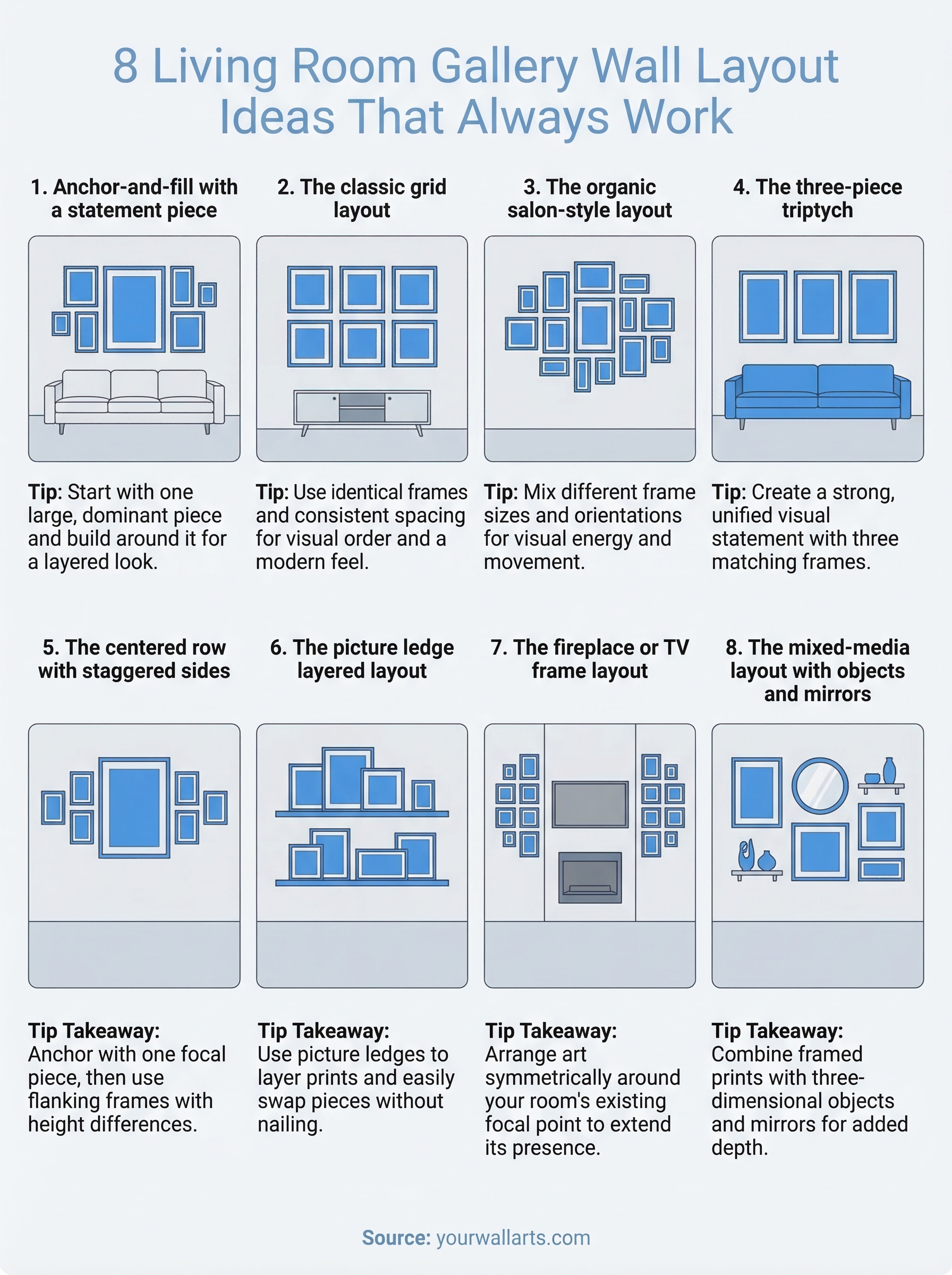
8 Living Room Gallery Wall Layout Ideas That Always Work
You picked out prints you love, maybe a moody Viking scene, a striking animal portrait, or something abstract and bold. Now they're leaning against the wall because you can't figure out how to arrange them. Sound familiar? Finding the right living room gallery wall layout ideas isn't just about hanging frames in a straight line. It's about creating a composition that feels intentional, not random.
The layout you choose affects how your entire living room feels. A tight grid reads clean and modern. A salon-style arrangement brings energy and personality. Pick the wrong one, and even great art can look like an afterthought. The good news? You don't need to hire a designer. You just need a layout that matches your space, your style, and the pieces you want to showcase.
At Yourwallarts, we make premium canvas and acrylic glass prints in multiple sizes, which means mixing and matching across a gallery wall is something our customers do all the time. That hands-on experience shaped this list. Below, you'll find eight gallery wall layouts that consistently work in real living rooms, whether you're starting from scratch or rearranging what you already have. Each one includes practical tips so you can plan with confidence and hang without regret.
1. Anchor-and-fill with a statement piece
This layout is one of the most forgiving and visually satisfying living room gallery wall layout ideas you can try. You start with one large, dominant piece and build everything else around it. The statement piece sets the visual center, and the surrounding smaller pieces fill in the space without competing for attention.
What it looks like
The anchor is typically a large-format print, something in the 60x90 cm or 80x120 cm range, positioned near the center of your arrangement. Smaller pieces fan out around it, either symmetrically or in a loose cluster. The result looks layered and intentional without feeling rigid or over-planned.
Best wall and furniture match
This approach works best above a sofa or console table, where the furniture gives the arrangement a natural base. Wide walls with at least 150 cm of horizontal space give the composition room to breathe. Narrow segments under 100 cm tend to crowd the layout, so avoid anchoring on a wall that can't absorb the surrounding pieces comfortably.
Sizing and spacing rules
Your anchor piece should carry roughly one-third to one-half of the total visual weight of the arrangement. Keep 5 to 8 cm of space between each frame for a tight, curated look. Larger gaps work too, but keep them consistent so the spacing feels deliberate rather than accidental.
Consistent spacing is the single most important factor in making any gallery wall look like it was done on purpose.
How to plan it on the wall
Start by tracing your frames onto craft paper or newspaper, cutting them out, and taping the paper templates to the wall with painter's tape. Place your anchor piece first, then arrange the smaller pieces around it until the balance feels right. This method lets you test the full composition without putting a single nail in the wall, which saves both time and unnecessary holes.
Art picks that make it feel cohesive
Choose an anchor print with strong visual impact, such as an animal portrait or a dramatic wide landscape, and echo its color palette in the surrounding pieces. Mixing canvas and acrylic glass finishes adds texture contrast without breaking the theme. Keep your surrounding prints in a tighter size range, like 40x50 cm or 40x60 cm, so nothing pulls focus away from your statement piece.
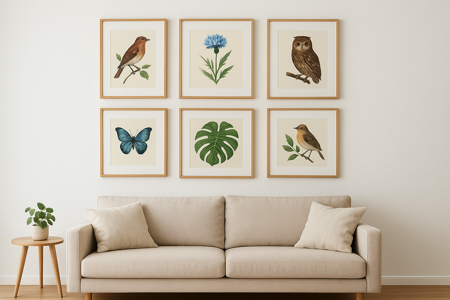
2. The classic grid layout
The grid is one of the most dependable living room gallery wall layout ideas you can use because it delivers instant visual order. Every frame is the same size, aligned in equal rows and columns, creating a pattern that reads as structured and intentional from across the room.
What it looks like
A classic grid uses identical frames in a symmetrical arrangement, typically 2x2, 3x3, or 2x3. The repetition of matching sizes and equal gaps gives the display an almost architectural quality, which is why this layout looks polished with very little effort.
Best wall and furniture match
This layout performs best above low, horizontal furniture like a sofa or sideboard, where the grid's rectangular outline mirrors the furniture below. It suits modern, minimalist, and Scandinavian-influenced interiors particularly well because the clean geometry reinforces the room's existing lines.
Sizing and spacing rules
Pick one frame size throughout, such as 40x60 cm, and keep gaps between 4 and 6 cm. Consistency matters here more than in any other layout because even a 1 cm variation in spacing becomes obvious when every frame shares the same dimension.
Measure twice before you nail once. A grid punishes inconsistency more than any other layout.
How to plan it on the wall
Cut paper templates for each frame, tape them in formation on the wall, and measure the total grid width before placing a single nail. Center the arrangement against the furniture below to anchor the composition visually.
Art picks that make it feel cohesive
Choose prints from a single thematic series, like animal portraits or nature scenes that share a consistent color palette. Switching styles or tones within the grid breaks the visual rhythm the format depends on to work.
3. The organic salon-style layout
The salon-style layout is the most expressive of all living room gallery wall layout ideas. It ditches symmetry and uniform sizing in favor of an eclectic mix of frames, sizes, and orientations that grow organically from a rough center point outward.
What it looks like
This layout layers different frame sizes and shapes in a loose, expanding arrangement. Nothing aligns perfectly, and that's the point. The variety creates visual energy and movement that draws the eye across the entire wall.
Best wall and furniture match
Salon-style works best on large, open walls with minimal architectural interruptions like windows or doors. It suits bohemian, maximalist, and eclectic interiors where more visual texture is welcome rather than distracting.
Sizing and spacing rules
Mix at least three different frame sizes, ranging from small accent pieces around 30x40 cm to larger anchors at 60x90 cm or bigger. Keep gaps between 5 and 10 cm, but allow slight variation. Total consistency in spacing would actually work against this layout's character.
The salon-style layout only looks random. Every placement decision still needs to balance visual weight across the full arrangement.
How to plan it on the wall
Lay all your frames flat on the floor first and arrange them until the overall shape feels balanced. Then transfer the arrangement to paper templates on the wall before nailing anything.
Art picks that make it feel cohesive
Pick pieces that share at least one unifying element, such as a consistent color palette, a recurring subject like wildlife or landscapes, or a matching frame finish. Without that thread, the layout tips from curated into chaotic.
4. The three-piece triptych over the sofa
The triptych is one of the most structured living room gallery wall layout ideas available, and it delivers a strong, unified visual statement with very little planning. Three pieces hang in a horizontal row, each one a matching size, creating a single cohesive image or a thematically connected sequence.
What it looks like
Three equal-sized prints sit side by side in a straight horizontal line. The arrangement can feature a single image split across all three panels or three separate but thematically related pieces that read as a set.
Best wall and furniture match
This layout is purpose-built for above the sofa. The horizontal span of three matching frames mirrors the width of a standard three-seat sofa and anchors the furniture to the wall in a way that feels deliberate and complete.
A triptych works best when the total width of the three frames sits within 10 cm of the sofa width below it.
Sizing and spacing rules
Use 40x60 cm or 50x70 cm prints for each panel. Keep gaps between frames at 4 to 6 cm so the three pieces read as a unified set rather than three separate artworks.
How to plan it on the wall
Measure your sofa width, then center the three-frame span against it. Use paper templates to confirm placement before you nail anything.
Art picks that make it feel cohesive
A wide landscape, an animal portrait, or a nature scene split across three panels works especially well. Matching canvas finishes across all three panels keeps the triptych feeling unified.
5. The centered row with staggered sides
This layout sits between the strict symmetry of a grid and the looseness of salon-style, making it one of the more versatile living room gallery wall layout ideas available. A single centered piece anchors the middle row, with smaller frames stepping up or down on each side to create a dynamic staircase effect.
What it looks like
The arrangement features one focal piece in the center at a mid-height, with smaller prints on the left and right positioned slightly higher or lower. The result is a horizontal layout with visual rhythm that moves the eye across the wall rather than holding it in one spot.
Best wall and furniture match
This layout suits narrow-to-medium walls between 100 and 180 cm wide. It works well above a console table, fireplace mantel, or short bookshelf where the staggered height variation adds interest without overwhelming the space.
Sizing and spacing rules
Use a medium center piece around 50x70 cm and flank it with 40x50 cm or 40x60 cm prints. Keep gaps between frames at 6 to 8 cm to let the stagger read clearly rather than blending into a compressed cluster.
The staggered effect only works when the height differences between frames are noticeable. A 10 to 15 cm vertical shift between the center and side pieces is the minimum worth committing to.
How to plan it on the wall
Map the arrangement with paper templates taped to the wall before nailing anything. Start with the center piece, then position the flanking frames until the stagger feels balanced on both sides.
Art picks that make it feel cohesive
Pick prints with a shared subject or color palette, such as three landscape prints in earthy tones or a nature series in matching canvas finishes. Keeping the theme consistent prevents the staggered shape from reading as disorganized.
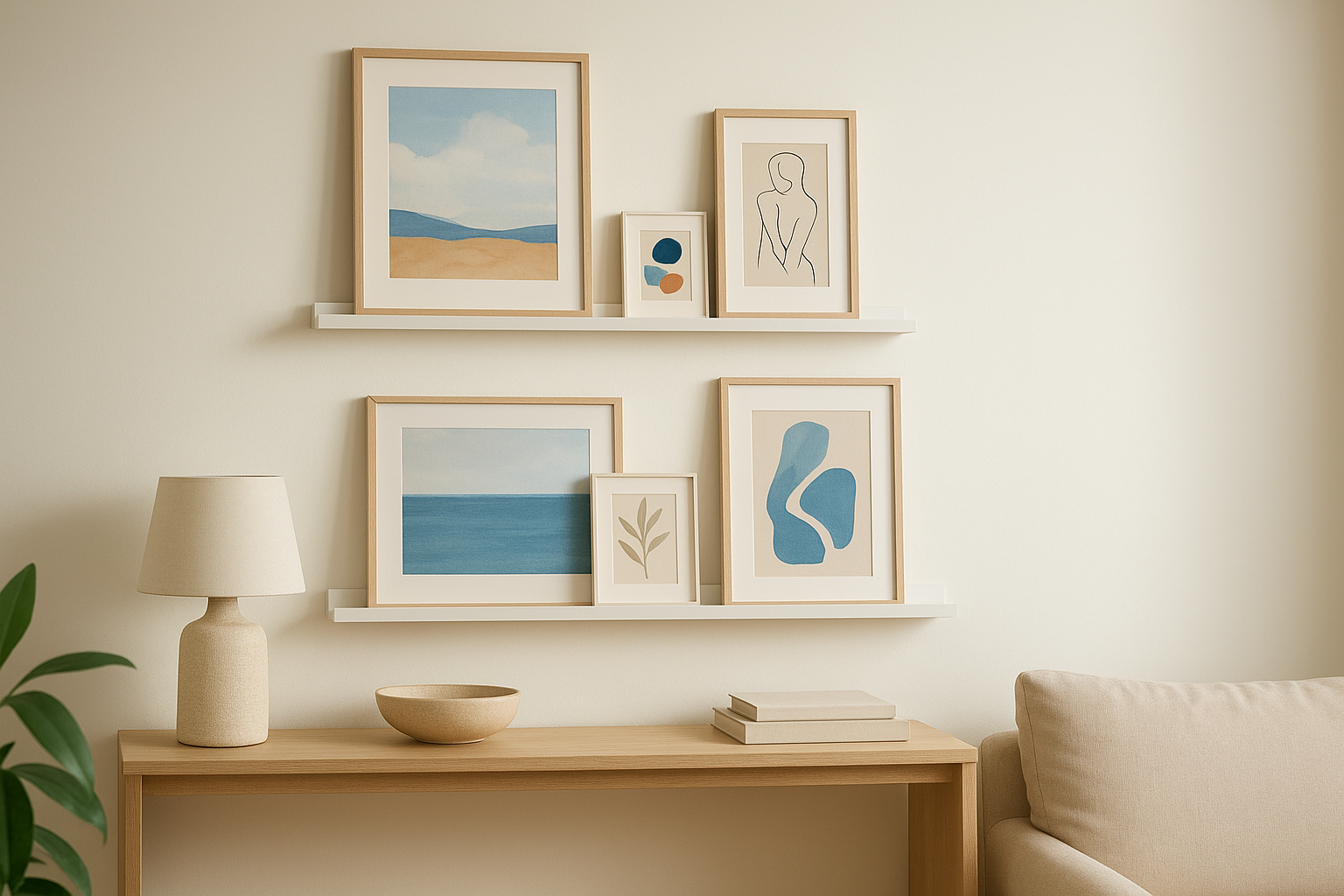
6. The picture ledge layered layout
Picture ledges give you a completely different approach to living room gallery wall layout ideas because nothing gets nailed to the wall permanently. You place prints on shallow shelves and lean them forward, which means you can swap pieces in and out without touching a single hammer.
What it looks like
Stacked ledges at different heights hold prints of varying sizes leaning at a slight angle. You can layer smaller prints in front of larger ones, creating depth that a flat wall arrangement can't achieve on its own.
Best wall and furniture match
This layout suits narrow walls and awkward alcoves where a nailed arrangement would feel cramped. It also works well above a console table or low media unit, where the ledges extend the vertical interest upward without overwhelming the space.
Sizing and spacing rules
Use two or three ledge shelves spaced 30 to 40 cm apart vertically. Mix print sizes from 30x40 cm up to 60x90 cm, keeping larger pieces toward the back and smaller accent pieces layered in front.
Layering depth is what separates this layout from every other option on this list, so lean into it rather than placing all pieces at the same depth.
How to plan it on the wall
Install your ledges level before adding any prints. Start with the largest back-layer pieces first, then build forward with smaller frames until the overall composition feels balanced.
Art picks that make it feel cohesive
Choose prints with complementary color palettes rather than matching subjects so the layered depth reads clearly. Canvas prints work particularly well here because their slight frame depth adds to the dimensional effect without adding excessive weight to the shelves.
7. The fireplace or TV frame layout
The fireplace or TV frame layout treats your room's existing focal point as the center of a larger visual composition. Instead of competing with the TV or fireplace, the surrounding art frames and reinforces it, turning a single functional feature into a full gallery moment. This is one of the most practical living room gallery wall layout ideas for rooms that already have a strong architectural anchor.
What it looks like
Art pieces cluster symmetrically on either side of the TV or above the fireplace mantel, extending the focal point outward without overcrowding it. The arrangement stays tight to the feature rather than spreading across the entire wall.
Best wall and furniture match
This layout suits media walls and chimney breast walls where the TV or fireplace already draws the eye. It works in both modern and traditional interiors, depending on the art you choose.
Sizing and spacing rules
Keep flanking pieces small to medium, around 40x50 cm or 40x60 cm, so they support rather than compete with the central feature. Maintain 5 to 7 cm gaps between frames and the TV or mantel edge.
Pieces hung too close to a working fireplace risk heat and soot damage, so keep art at least 30 cm above an active flame source.
How to plan it on the wall
Use paper templates taped to the wall to confirm placement before committing to any nails. Balance the weight visually on both sides of the feature.
Art picks that make it feel cohesive
Choose prints in warm or neutral tones that complement the materials around your fireplace or TV unit. Canvas finishes work well here because their textured surface softens the hard edges of screens and stonework.
8. The mixed-media layout with objects and mirrors
The mixed-media layout goes beyond prints and frames by bringing three-dimensional objects and mirrors into the arrangement. This approach gives your wall genuine depth and texture, making it one of the most distinctive living room gallery wall layout ideas for spaces that need more than flat art to feel complete.
What it looks like
This layout combines framed prints, a mirror or two, and wall-mounted objects like sculptural pieces or small shelves holding decorative items. The mix of flat and dimensional elements creates a layered composition that shifts as the light changes throughout the day.
Best wall and furniture match
Wide, open walls with at least 180 cm of horizontal space give this layout room to breathe. It suits eclectic and transitional interiors particularly well, where mixing materials and textures is already part of the room's character.
Sizing and spacing rules
Keep your mirrors no larger than your biggest framed print so they add light without dominating the arrangement. Maintain 6 to 10 cm gaps between all elements, including objects, so nothing feels crowded.
Mirrors reflect whatever sits across the room, so position them intentionally to bounce light toward a darker corner rather than back toward a window.
How to plan it on the wall
Lay all elements on the floor first. Map the overall silhouette with paper templates before hanging anything, treating objects and mirrors as weighted shapes that need balancing just like frames.
Art picks that make it feel cohesive
Choose prints with colors that echo the mirror frames or object materials in your arrangement. Canvas prints work well here because their warm, tactile surface pairs naturally with the variety of textures this layout introduces.
Bring your gallery wall to life
Every one of these living room gallery wall layout ideas works because it follows a simple principle: visual weight needs a home. Whether you go with a tight grid, a layered triptych, or a salon-style arrangement that fills an entire wall, the layout gives your art a structure that holds it together and makes the room feel complete.
You now have eight concrete starting points, each with clear sizing rules, spacing guidance, and art pairing suggestions you can act on today. Pick the layout that matches your wall size and your style, cut your paper templates, and test it before you touch a nail.
When you're ready to find prints worth building a gallery around, browse the full collection at Yourwallarts. From bold animal portraits to dramatic wide-format landscapes, every piece ships ready to hang so you can go from idea to finished wall faster than you'd expect.