

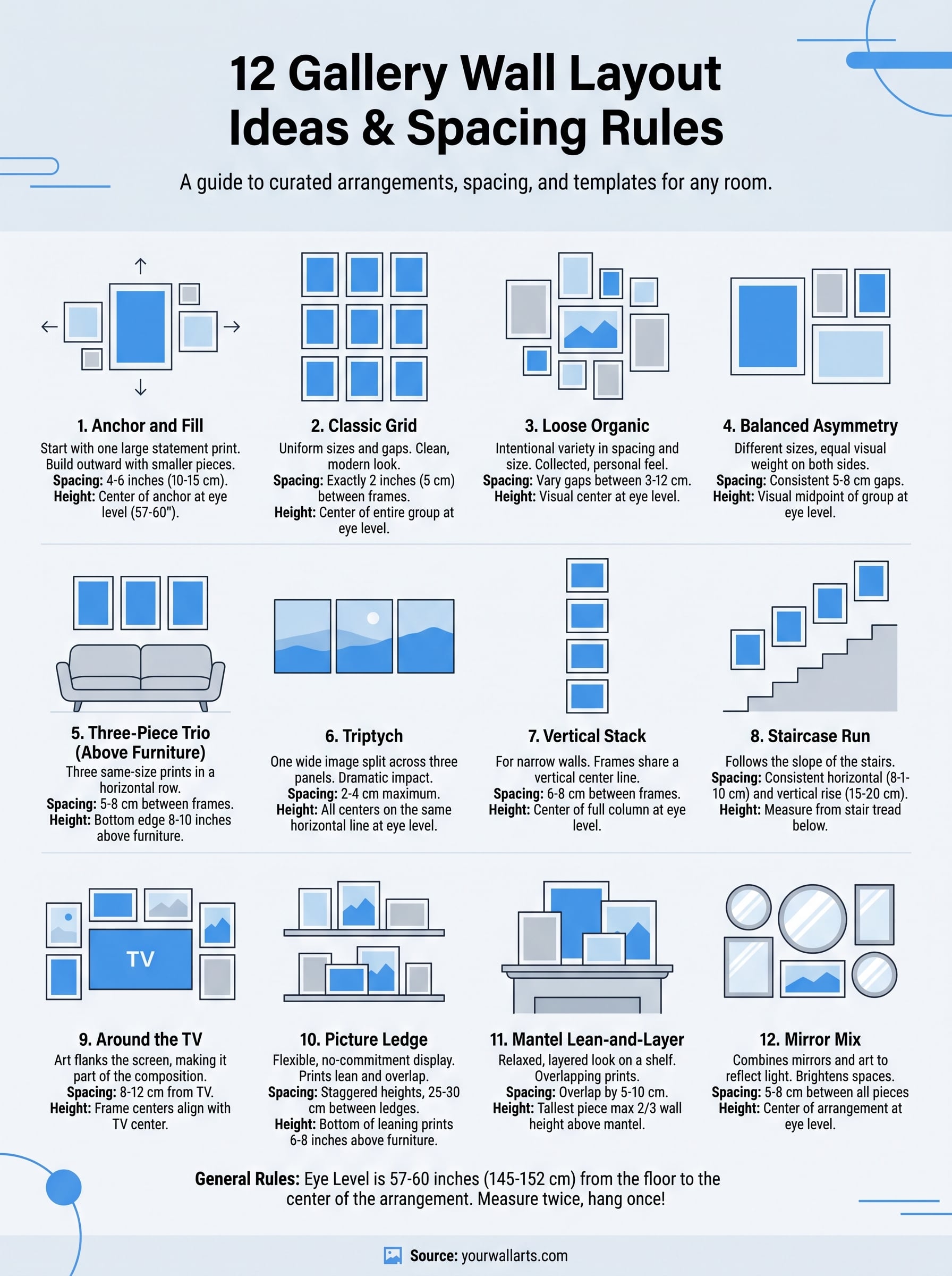
12 Gallery Wall Layout Ideas With Spacing Rules & Templates
You picked out prints you love, maybe a moody dark landscape, a Viking portrait, or a striking animal close-up. Now they're leaning against your wall, and the real question hits: how do you actually arrange them? Great gallery wall layout ideas start with a plan, not a hammer and a hopeful attitude. The difference between a wall that looks curated and one that looks chaotic comes down to spacing, alignment, and the layout you choose.
This guide breaks down 12 proven arrangements you can use in any room, whether you're working with a tight hallway or a wide living room wall. Each layout includes spacing rules and practical templates so you can map things out before drilling a single hole. We also cover how different print formats, like canvas and acrylic glass, both available at Yourwallarts, affect the overall look and feel of your gallery wall.
Grab a tape measure. Let's get into it.
1. Anchor and fill layout with a statement print
The anchor and fill layout is one of the most approachable gallery wall layout ideas you will find. You start with one large statement print and build outward with smaller pieces, which means you always have a visual reference point rather than trying to balance everything from scratch.
What it looks like
A single large print sits at the center or slightly off-center of the wall. Smaller prints surround it on all sides, filling the remaining space without competing for attention. The result feels intentional, like the wall was built around one main piece.
- Large anchor print dominates the center
- Mid-size prints flank the anchor left and right
- Small prints fill the upper and lower corners
Best rooms and wall shapes
This layout works best on wide, open walls in living rooms, bedrooms, or dining areas. It handles irregular wall shapes well because the anchor piece establishes the focal point regardless of exact dimensions. Wider walls of at least 6 feet give you enough room to spread the supporting pieces without crowding them.
Frame counts and size ranges
Plan on one large anchor print in the 60x90 cm or 80x120 cm range and four to eight smaller prints between 20x30 cm and 40x60 cm. You do not need a fixed number, but five to seven total pieces tends to hit the right balance between full and cluttered.
Spacing rules and hanging height
Keep 4 to 6 inches (10 to 15 cm) of space between each frame. Hang the center of your anchor print at eye level, roughly 57 to 60 inches (145 to 152 cm) from the floor. The surrounding pieces should align with the vertical or horizontal midpoint of the anchor, not its top or bottom edges.
Measure the center of each frame, not the top edge, when marking your wall. This single habit eliminates the most common hanging errors.
Template you can copy
- Anchor print (80x120 cm): wall center, midpoint at 58 inches from floor
- Two prints (40x60 cm): left and right of anchor, 5 cm gap each side
- Two prints (30x40 cm): above and below anchor, 5 cm gap
- One or two small prints (20x30 cm): fill remaining corner gaps
Common mistakes to avoid
The most common error is choosing an anchor that is too small, which makes the whole arrangement look tentative. A second mistake is spacing the surrounding pieces unevenly, leaving one side visually heavier than the other. Lay everything on the floor first and photograph it before you put a single nail in the wall.
2. Classic grid layout for a clean, modern look
The grid is one of the most recognizable gallery wall layout ideas you will come across. Every frame shares the same size, and every gap between frames stays identical, which creates a tight, uniform arrangement that reads as deliberately modern.
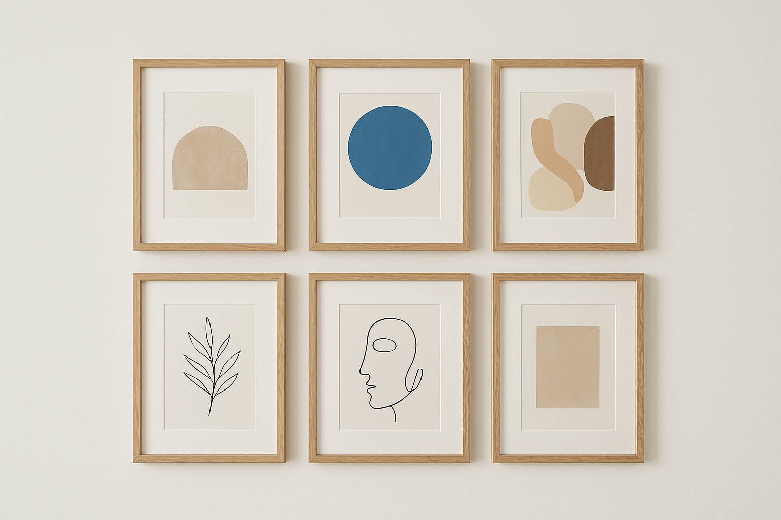
What it looks like
A grid hangs frames in even rows and columns, where no single print dominates. The uniformity is the entire point. Three prints across and two rows deep, or four across and three deep, both work cleanly and look intentional.
- All frames are the same size
- Gaps between frames stay equal on all four sides
- The arrangement forms a clear rectangle or square overall
Best rooms and wall shapes
This layout suits minimal, contemporary spaces like home offices, dining rooms, or open-plan living areas. It performs best on a flat, unobstructed wall with no doors, windows, or architectural features interrupting the surface.
Frame counts and size ranges
Six to nine frames is the sweet spot for most walls. Each print typically runs 30x40 cm or 40x60 cm, keeping the overall footprint manageable without looking sparse.
Spacing rules and hanging height
Keep exactly 5 cm (2 inches) between every frame on all sides. Hang the top row so the center of the full arrangement lands at eye level, around 57 to 60 inches from the floor.
Mark every nail point before you hang a single frame. Even one hole off by a centimeter breaks the grid's clean lines.
Template you can copy
- Six prints (40x60 cm): 3 columns, 2 rows, 5 cm gap on all sides
- Center the group horizontally on your wall
- Top row midpoint: 62 inches from floor, bottom row midpoint: 40 inches
Common mistakes to avoid
Mixing even slightly different frame sizes destroys the grid effect immediately. Also avoid frames with different mat widths, which creates the illusion of mismatched sizes even when the outer dimensions match.
3. Loose organic layout for a collected feel
The loose organic layout is the most free-form of all gallery wall layout ideas. Instead of aligning frames to a grid or anchoring everything to one large print, you spread pieces across the wall with intentional variety in spacing, orientation, and size, creating a wall that looks like it grew over time.
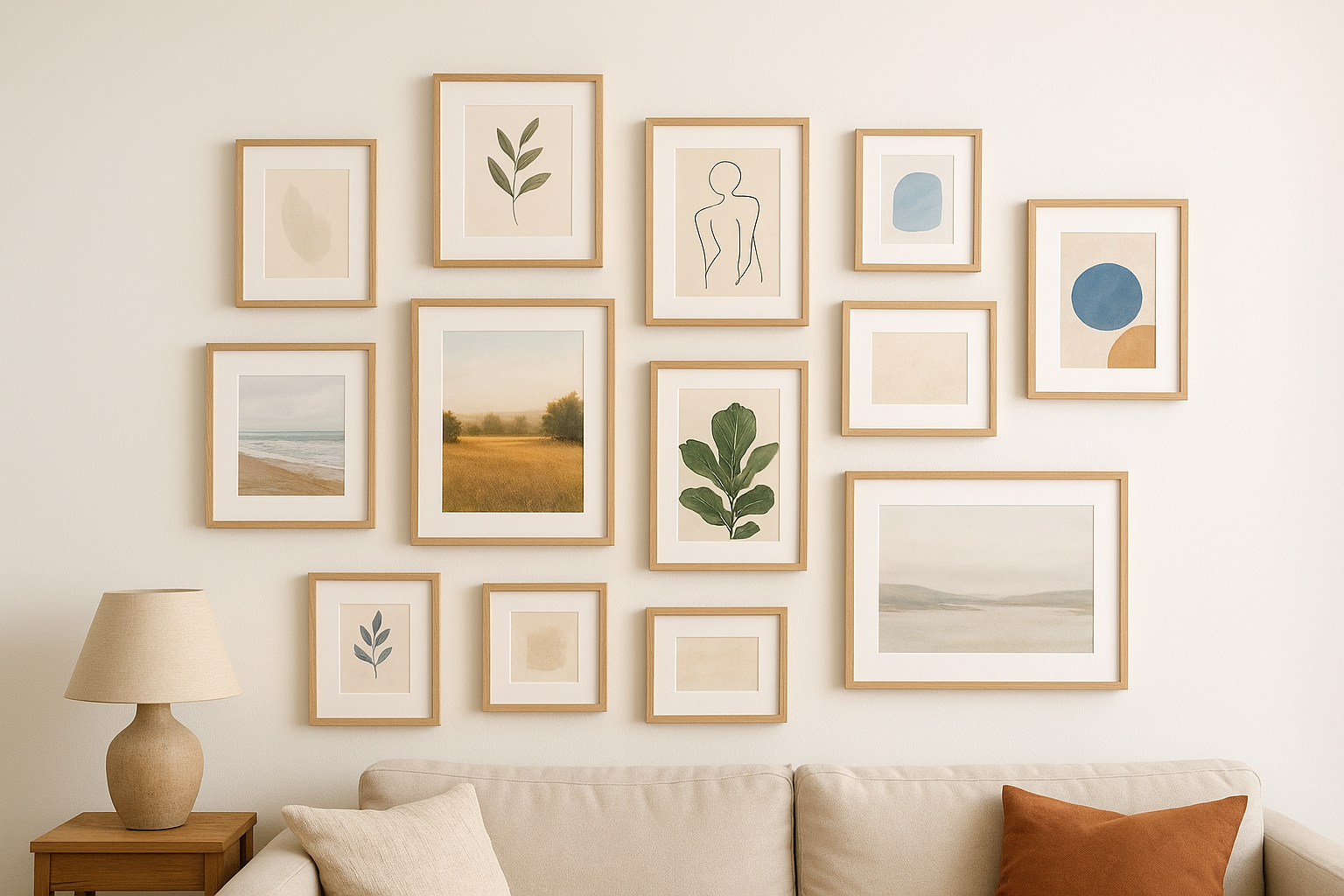
What it looks like
This layout breaks all the symmetry rules on purpose. Frames sit at varying heights with uneven gaps between them, and the overall shape of the arrangement is irregular rather than rectangular. The effect reads as personal and curated rather than designed.
- Mix of portrait, landscape, and square orientations
- No two gaps are the same size
- The arrangement has no hard outer edge
Best rooms and wall shapes
Loose organic works best in living rooms, reading nooks, and bedrooms where the mood is warm and personal rather than minimal. It also handles oddly shaped walls well, including those with sloped ceilings or architectural interruptions like windows.
Frame counts and size ranges
Use seven to twelve pieces across a range of sizes, typically mixing 20x30 cm, 30x40 cm, and 40x60 cm prints. Avoid going too large on any single piece or it pulls focus and breaks the collected feel.
Spacing rules and hanging height
Vary your gaps intentionally between 3 cm and 12 cm, but never let two frames touch. Hang the visual center of the arrangement at 57 to 60 inches from the floor, even if individual frames drift above or below that line.
Lay all your pieces on the floor and photograph the arrangement from above before committing to a single nail hole.
Template you can copy
- Three prints (40x60 cm): scattered across the upper half, no shared baseline
- Four prints (30x40 cm): fill middle and lower zones at varying heights
- Two to three prints (20x30 cm): tuck into gaps where the wall feels sparse
Common mistakes to avoid
The biggest risk with this layout is ending up with unintentional clustering, where all the small pieces drift to one side. Step back frequently while planning and check that visual weight stays roughly balanced across the full arrangement.
4. Balanced asymmetry layout that still feels orderly
Balanced asymmetry sits between the strict grid and the loose organic layout. You use different frame sizes and heights but distribute visual weight evenly across the wall, so the arrangement feels considered rather than random.
What it looks like
This layout places frames at different heights on either side of an invisible vertical center line, while keeping the total mass on each side roughly equal. One side might carry a single large print while the other holds two or three smaller ones that add up to similar visual weight.
Best rooms and wall shapes
Living rooms and entryways are the strongest match for this layout when you want personality without clutter. It also adapts well to walls with mild architectural interruptions, such as a light switch or a single window sitting slightly off-center.
Frame counts and size ranges
Plan on five to eight frames mixing at least two size categories. A combination of 40x60 cm and 30x40 cm prints keeps the arrangement varied without becoming chaotic.
Spacing rules and hanging height
Hold consistent 5 to 8 cm gaps between every frame even though the arrangement looks uneven overall. Hang the visual midpoint of the whole group at 57 to 60 inches from the floor.
Sketch the layout on paper first, then check that the left and right halves carry similar visual weight before you mark the wall.
Template you can copy
- One print (60x90 cm): left side, midpoint at 58 inches from floor
- Two prints (30x40 cm): stacked on the right, 6 cm gap between them
- Two prints (20x30 cm): fill upper and lower right to balance the large left piece
Common mistakes to avoid
The most frequent error is treating "asymmetry" as permission to ignore balance entirely. If one side carries significantly more frames or larger pieces, the wall feels lopsided rather than dynamic.
5. Three-piece trio layout above a sofa or bed
The three-piece trio is one of the most versatile gallery wall layout ideas for anchoring a large piece of furniture. Three prints hang in a horizontal row, creating a wide visual band that fills the space above a sofa, bed headboard, or console table without overwhelming it.
What it looks like
Three prints of the same size line up side by side with equal gaps between each frame. The row reads as a single cohesive unit. You can use matching prints or three separate images that share a common color palette or theme to keep the arrangement unified.
Best rooms and wall shapes
This layout works best directly above a sofa or a bed, where the furniture anchors the arrangement below. Wide walls of at least five feet give the trio room to breathe. Narrow walls make three prints feel cramped, so switch to a vertical stack instead.
The trio row should span roughly two-thirds the width of the furniture below it for the best visual proportion.
Frame counts and size ranges
Use three prints of equal size, typically 40x60 cm or 50x70 cm. Matching dimensions keep the row clean. Mixing sizes in this layout usually breaks the horizontal rhythm and makes the arrangement feel unfinished.
Spacing rules and hanging height
Keep 5 to 8 cm between each frame. Hang the bottom edge of all three prints 8 to 10 inches (20 to 25 cm) above the top of the sofa or headboard to avoid the prints looking like they float too high or sit too close to the furniture.
Template you can copy
- Three prints (40x60 cm): hung in a horizontal row, 6 cm gap between each
- Bottom edge of all frames: 22 cm above sofa back
- Center the row horizontally over the furniture
Common mistakes to avoid
Hanging the trio too high above the furniture is the most common error. It disconnects the prints from the sofa and makes both elements look like they belong to separate parts of the room. Keep the gap tight and intentional so the art and the furniture read as one unit.
6. Triptych layout for panoramas and bold scenes
A triptych splits one wide image or scene across three separate panels, which you hang side by side with a narrow gap between each piece. Among all the gallery wall layout ideas in this guide, this one delivers the most visual impact per square foot because the eye reads the three panels as a single dramatic composition.
What it looks like
Three panels display one continuous image across their combined width. The break lines between the panels add tension rather than distraction, making bold landscapes, animal portraits, or dark dramatic scenes feel even more powerful.
Best rooms and wall shapes
Triptychs belong in living rooms and primary bedrooms where the wall space is wide and unobstructed. A minimum wall width of 5 feet (150 cm) keeps the panels from crowding together. Avoid this layout on walls with a window or door interrupting the run.
Frame counts and size ranges
Use three equal-size panels in the 40x60 cm or 60x90 cm range. Matching dimensions are non-negotiable here since the panels need to form a seamless whole.
Spacing rules and hanging height
Keep the gap between panels to 2 to 4 cm maximum. A wider gap breaks the illusion that the image is continuous. Hang all three panels so their centers share the same horizontal line, sitting at 57 to 60 inches from the floor.
Measure from the center of each panel, not the edge, when marking nail positions to keep all three at a perfectly level height.
Template you can copy
- Three panels (40x60 cm): horizontal row, 3 cm gap between each
- All centers at 58 inches from the floor
- Total width of arrangement: roughly 126 cm
Common mistakes to avoid
The worst error is hanging the three panels at slightly different heights, which destroys the continuous image effect entirely. Use a laser level or long spirit level across all three nail points before you hang anything.
7. Vertical stack layout for narrow walls
When your wall is too narrow for a horizontal spread, the vertical stack becomes one of the most practical gallery wall layout ideas available. You work with the wall's natural constraints by stacking two to four prints in a single column, turning a limitation into a deliberate design choice.
What it looks like
A vertical stack lines up frames in a straight column from top to bottom. Each print shares the same horizontal center line, so the column reads as a clean, intentional arrangement rather than a random cluster.
Best rooms and wall shapes
This layout fits hallways, narrow entryways, and the slim wall between two doorways. Any wall under 36 inches (90 cm) wide benefits from a vertical approach rather than forcing a horizontal layout that would crowd the space.
Frame counts and size ranges
Two to four frames is the right range. Keep each print between 30x40 cm and 40x60 cm so the column fills the wall without the frames touching each other or the ceiling.
Spacing rules and hanging height
Leave 6 to 8 cm between each frame in the stack. Hang the center of the full column at eye level, roughly 57 to 60 inches from the floor, so the arrangement sits within natural sightlines rather than drifting too high.
Treat the column as one unit when calculating hanging height, not as individual pieces.
Template you can copy
- Three prints (30x40 cm): stacked vertically, 7 cm gap between each
- Center the column on the wall horizontally
- Middle frame center: 58 inches from the floor
Common mistakes to avoid
Stacking frames with unequal gaps is the most common error, making the column look accidental. Measure every gap before you mark the wall.
8. Staircase run layout that follows the slope
The staircase run is one of the most site-specific gallery wall layout ideas in this guide. Instead of fighting the diagonal line of a staircase wall, you work with it, stepping each frame up or down the slope so the arrangement mirrors the angle of the stairs beneath it.
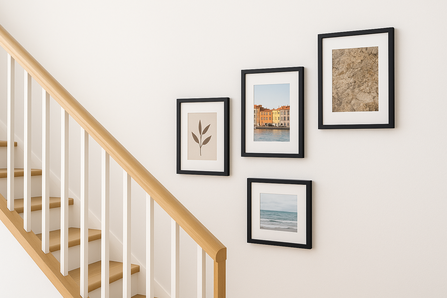
What it looks like
Each frame hangs at a progressively higher or lower position as you move along the wall, forming a diagonal line that runs parallel to the staircase. The frames share consistent spacing and often use matching or complementary print sizes to keep the diagonal clean and intentional.
Best rooms and wall shapes
This layout exists specifically for staircase walls, whether straight-run stairs or a long landing corridor. The wall must follow a clear slope or step pattern for the arrangement to read correctly.
Frame counts and size ranges
Three to five frames is the ideal range for most staircases. Stick to one or two frame sizes, typically 30x40 cm or 40x60 cm, so the diagonal step pattern stays legible rather than chaotic.
Spacing rules and hanging height
Keep 15 to 20 cm of vertical rise between each frame as you move up the slope. Maintain a consistent horizontal gap of 8 to 10 cm between frames. Each frame's center should sit roughly 57 to 60 inches from the stair tread directly below it.
Measure from the tread, not the floor, when setting hanging heights on a staircase wall.
Template you can copy
- Four prints (30x40 cm): diagonal run, each stepping up 18 cm vertically
- Horizontal gap between frames: 9 cm
- Each frame center: 58 inches above the nearest tread
Common mistakes to avoid
The most common error is hanging all frames at the same height from the floor rather than stepping them with the stairs. This produces a flat horizontal line that fights the staircase angle instead of following it.
9. Around the TV layout that makes the screen blend in
A TV mounted on a bare wall tends to dominate the room. Surrounding it with art is one of the most practical gallery wall layout ideas for pulling the screen into a larger visual composition so it reads as one element rather than the centerpiece.
What it looks like
Art frames flank the TV on the left and right, and sometimes above, creating a wide horizontal grouping that makes the screen look intentional rather than isolated. The TV acts as the anchor point, and the surrounding prints balance its visual weight.
Best rooms and wall shapes
Living rooms with a dedicated media wall are the natural fit. The wall needs enough width to place at least two frames on each side of the screen without crowding the edges.
Frame counts and size ranges
Use four to six prints in the 20x30 cm to 40x60 cm range. Keeping frames smaller than the TV itself prevents them from competing with the screen.
Spacing rules and hanging height
Maintain 8 to 12 cm between the TV and the nearest frame on each side. Keep all frame centers at roughly the same horizontal line as the TV's center for a unified arrangement.
Never hang prints above the TV if they force viewers to look up at the screen, which strains the neck during extended viewing.
Template you can copy
- Two prints (40x60 cm): one on each side of the TV, 10 cm gap from screen edge
- Two prints (30x40 cm): above the side prints, aligned to the TV's top edge
Common mistakes to avoid
Placing frames too close to the screen makes the whole arrangement feel crowded. Also avoid prints with very dark or busy imagery directly beside the TV, which creates visual competition when the screen is off.
10. Picture ledge layout for no-commitment styling
A picture ledge turns your wall into a flexible display shelf where prints lean rather than hang. This is one of the most forgiving gallery wall layout ideas in this guide because you can rearrange, swap, or add pieces without touching a single nail hole beyond the ledge brackets themselves.
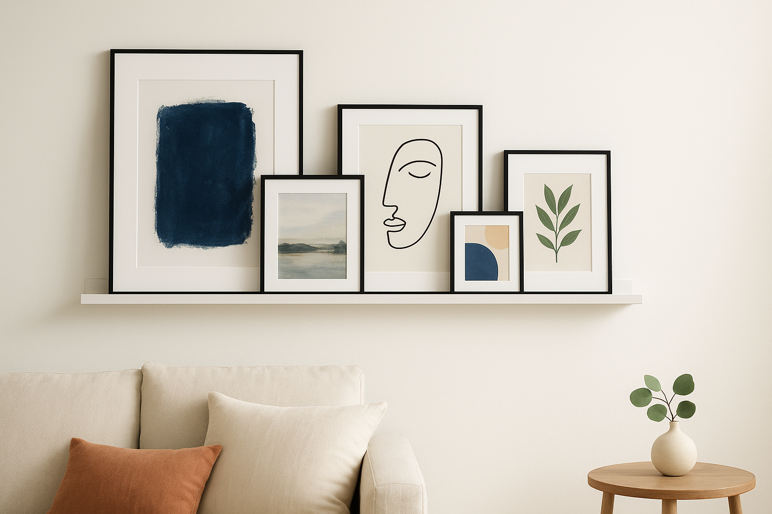
What it looks like
Prints lean against the wall on one or more horizontal shelves, overlapping slightly at the edges. The arrangement feels relaxed and layered rather than fixed, and the overall look reads as intentionally casual.
Best rooms and wall shapes
This layout works well in living rooms, bedrooms, and home offices where you want to change the art seasonally. It suits walls of any width since you can mount one short ledge or several full-length ones side by side.
Frame counts and size ranges
Place three to eight prints per ledge, mixing sizes between 20x30 cm and 60x90 cm. Lean larger prints at the back and smaller ones in front to create visible depth across the shelf.
Spacing rules and hanging height
Mount the ledge so the bottom of the leaning prints sits 6 to 8 inches above the furniture below it. If you stack two ledges, leave 25 to 30 cm of vertical space between them so the upper prints on the lower ledge don't block the shelf above.
Stagger the heights of leaning prints so the tops form an uneven, natural-looking line rather than a flat horizontal row.
Template you can copy
- One ledge (120 cm wide): two large prints (60x90 cm) leaning at the back, three small prints (20x30 cm) layered in front
- Ledge mounted with its surface at 58 inches from the floor
Common mistakes to avoid
Overcrowding the ledge is the most frequent error with this layout. Leave enough room between prints so each piece stays clearly visible rather than disappearing behind the ones positioned in front of it.
11. Mantel lean-and-layer layout for easy swaps
The mantel lean-and-layer is one of the most low-commitment gallery wall layout ideas you will find. Instead of nailing prints directly to the wall, you lean them against it on top of a fireplace mantel or a deep console shelf, layering pieces in front of each other for depth and dimension.
What it looks like
Prints of varying sizes lean at slight angles against the wall, with smaller frames overlapping larger ones at the front. The arrangement looks relaxed and personal, built up in natural layers rather than laid out on a strict grid.
Best rooms and wall shapes
This layout belongs above a fireplace mantel or on a console shelf in a living room or entryway. The surface below the prints does the structural work, so you need at least 8 to 12 inches of shelf depth to keep everything stable.
Frame counts and size ranges
Use three to six prints, mixing one or two larger pieces (40x60 cm or 60x90 cm) in the back row with two to four smaller prints (20x30 cm or 30x40 cm) layered in front.
Spacing rules and hanging height
Let prints overlap by 5 to 10 cm at the sides rather than spacing them apart. The tallest piece in the back should sit no higher than two-thirds of the wall height above the mantel to keep the proportions balanced.
Keep the full arrangement no wider than the mantel surface itself so nothing looks at risk of tipping forward.
Template you can copy
- Two prints (60x90 cm): leaning at the back, roughly 10 cm apart
- Two prints (30x40 cm): overlapping in front, offset left and right
- One print (20x30 cm): tucked front-center to add depth
Common mistakes to avoid
Stacking too many layers pushes the front prints forward and hides the pieces behind them entirely. Keep your arrangement to two rows maximum and check that every print stays stable before you walk away.
12. Mirror mix layout to brighten small or dark spaces
The mirror mix is one of the most functionally smart gallery wall layout ideas in this guide. You combine decorative mirrors with art prints to reflect light back into a room, making a tight or dim space feel noticeably larger and brighter without changing a single fixture.
What it looks like
Mirrors of varying shapes and sizes hang alongside framed prints in a loose, organic arrangement. The mirrors break up the visual weight of the frames while bouncing light around the room, adding depth that art alone cannot achieve.
Best rooms and wall shapes
This layout suits small living rooms, narrow entryways, and bedrooms with limited natural light. Any wall that faces a window benefits most since the mirrors reflect that incoming light across the room.
Position at least one mirror so it directly faces or angles toward your main light source for maximum effect.
Frame counts and size ranges
Use two to three mirrors alongside three to five art prints. Keep individual mirrors in the 30x40 cm to 50x50 cm range so they complement the prints rather than dominate the wall.
Spacing rules and hanging height
Maintain 5 to 8 cm between every piece, whether mirror or print. Hang the center of the full arrangement at eye level, roughly 57 to 60 inches from the floor, treating mirrors and frames as equal elements in the layout.
Template you can copy
- Two mirrors (40x40 cm): upper left and lower right of the arrangement
- Three prints (30x40 cm): fill the remaining positions
- All centers at 58 inches from the floor, 6 cm gaps throughout
Common mistakes to avoid
Clustering all mirrors on one side creates uneven brightness and breaks the visual balance. Distribute them across the arrangement so the light reflection spreads evenly rather than pooling in one corner.
Next steps for your gallery wall
You now have twelve gallery wall layout ideas with specific spacing rules, size ranges, and templates you can copy directly. Pick one layout that matches your wall shape and the furniture already in the room, then sketch it on paper before you touch the wall. Measure twice, hang once is not a cliché here; it is the single habit that separates a clean result from a wall full of patched holes.
Once your layout is set, the prints you choose carry just as much weight as the arrangement itself. Bold themes like dark landscapes, animal close-ups, or striking nature scenes give a gallery wall real personality rather than generic filler. Browse the full collection at Yourwallarts to find canvas and acrylic glass prints that fit your chosen layout, with sizes ranging from 40x60 cm to 80x120 cm ready to ship within one to two business days.